Showing posts with label InitialResearch. Show all posts
Showing posts with label InitialResearch. Show all posts
Wednesday, 18 December 2013

Thursday, 28 November 2013
Thursday, 7 November 2013
Analysing Michael Jackson
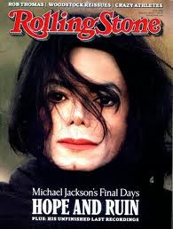
2) Michael Jackson is wearing black clothes and his hair is messed up, this suggest that he is no longer the iconic music figure the world knows but a broken man.
3) No props have been used on this image
4) You cant really see the setting but it is a natural setting maybe used to represent how Michael Jackson looks naturally.
 5) No intertextual references
6) The colour black features a lot and it mainly represents death and maybe the death of his career.
!) This image has been cropped to just a mid shot to show Michael Jackson's body and to put him out there as this fresh musical talent
2) Michael is just wearing a vest and this is used maybe to reveal his physicality and make him appeal more to the target audience.
3) No props have been used.
4) The setting used is like maybe a wall from a normal neighborhood to represent him as a normal person and just like any other person in America.
5) There are no intertextual references.
6) The white vest can represent new life as he is new in the music businessn and can grow and achieve great things.
Thursday, 10 October 2013


Thursday, 3 October 2013


Angels magazine cover and contents page


Monday, 30 September 2013


Wednesday, 25 September 2013

Magazine Plan
Front Cover
It will feature a model who is surrounded with books to show that she or
he is studying as the message is hard work and which will be associated with
the masthead The sell line will be "Work now, Play later"
" 5 tips for success" "new life" as the articles in the
magazine will be in there. It will feature all the conventions of a regular
magazine and it will be short and snappy and bold so it catches the reader's
attention.
Inside pages
- It will feature the main
sell line's article
- The information will be
written without complex words
- Background related to the
theme
- Articles related to the main
message
- Pictures related to the
topic
- Bold eye-catching titles
(masthead included)
Monday, 16 September 2013
Magazine Analysis
Chelsea FC
The masthead "chelsea" features the club's name as it its a club magazine and for private circulation. Its in simple font and bold so that it is easier for fans of all ages to read.
This magazine features some of the conventions of magazines as the model is facing the reader (direct mode of address) and one of the sell lines is "Hazard's Warning" because the model's name is Eden Hazard and the article features an article about what he aims to do as he is a new player to the team at the time. The banner at the bottom is also a convention, it feature the club's main sponsors and any extra things that might be in the magazine. This cover lacks enough information as there is no indication of the price of the magazine and enough sell lines.

The masthead "chelsea" features the club's name as it its a club magazine and for private circulation. Its in simple font and bold so that it is easier for fans of all ages to read.
This magazine features some of the conventions of magazines as the model is facing the reader (direct mode of address) and one of the sell lines is "Hazard's Warning" because the model's name is Eden Hazard and the article features an article about what he aims to do as he is a new player to the team at the time. The banner at the bottom is also a convention, it feature the club's main sponsors and any extra things that might be in the magazine. This cover lacks enough information as there is no indication of the price of the magazine and enough sell lines.

Subscribe to:
Posts (Atom)