Friday, 4 April 2014

Thursday, 3 April 2014
Wednesday, 2 April 2014
Evaluation question 1
In what
ways does your media product use,develop or challenge forms and conventions of
real media products
My work does look like a music magazine as it uses some of
the main conventions associated with a music magazine especially one of its
genre for example I used appropriate sell lines and a masthead for my
productions.. I tried to use a colour scheme that would be appropriate and
appeal to them. This is why I used grey black, red and white in order to make
the writing on the sell lines and masthead stand out when the public view it.
As a result my magazine does convert to magazine conventions as there's no point
changing that as the magazine might end up not looking like a music magazine,
so it is better to conform to the conventions as they are so effective on other
magazines and it's what has made them so successful in the past.
However, to an extend my magazine does challenge conventions
as the inclusion of a female model, especially for a DPS. This genre is widely
male dominated so it would be unusual to feature a female as the main focus.
Hopefully this would help gain me more female readers.
Using other magazines
as influence for my magazine was helpful as it provides a template for the
layout of your magazine. This also helps it fit into the music genre of rap
along with the use of the models as if used models that would appeal to the
demographic. The photography is kind of stereotypical when it comes to rap
artist, due to the fact it features typical costume props and
archtype/stocktype characters. This was done in order to appeal to the audience
and perform better in the market. Subverting to formulaic styles of rap
important as what they've done has been successful for them and you would want
your magazine also to be successful. The mise en scene is critical as people
are often attracted to an artist on how the look so it is an important element
to consider during photography process as this can determine whether or not
people would buy your magazine or not. I went with the typical hoodie and
snapback with my models that are mainly associated with artists of this genre
so that the audience can relate this to other magazines and have a first
assumption that this magazine is like other they've read before and maybe
better.
Monday, 31 March 2014


Wednesday, 19 March 2014
Contents page Draft
After receiving feedback from the class and teacher i decided to change the contents page as i felt it wasn't good enough and they confirmed my feelings. I think i was trying to hard to make it look unique that i made it look bad so after amending these changes this it how it looks now
![]()

Wednesday, 12 March 2014
Contents page drafting 2

Firstly, I started working on the design and layout. I tried to imitate the contents page as seen on XXL magazine as their layout was very effective in the way information was displayed easily.

Secondly i started working on the text, the most important being the 'featured' section. This is done in bold and in bigger font as you want to attract the readers attention immediately. then after that i adhered to the same font and colour scheme like many conventional magazines do but in smaller font in comparison to the featured section.

Finally its about adding the o,age to finalise the page. The overall draft can be subject to change but this is how it looks like for now.
Saturday, 8 March 2014
Front cover Draft
After receiving feedback i knew that i had to alter how the front cover looked and also realised how i made some mistakes and how i needed to stick with my colour scheme so i changed the background and to keep the black, red and white colour scheme like i have been doing all along. I've also changed the sell lines to make them more appealing to the demographic audience. I also changed the image of the model(show more of it) to make the front cover overall better.

Thursday, 6 March 2014
Magazine DPS draft

DPS pictures evidence

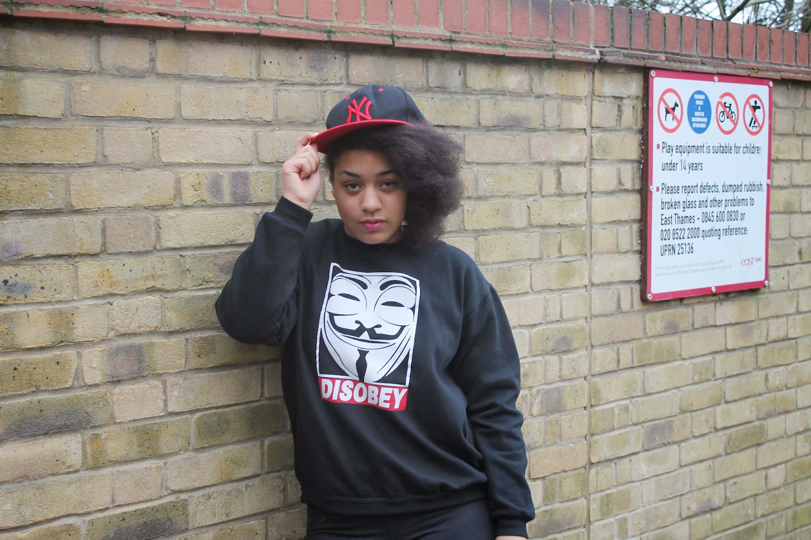


The are the new pictures i stuck with after deciding to change the models and use the female model for the DPS and the other male model for the Contents page
Wednesday, 5 March 2014
Front Cover drafting stages

 , thinking about layering and what will go where in the space.
 Firstly image editing to see which one would fit better.Eventually chose black and white as it went well with the colour scheme of the sell lines.
Adding the sell lines so it adheres to the conventions of a magazine.

Finished product after adding extra stuff
Sunday, 2 March 2014
DPS Dragting stages

Firstly I decided to start of with the image as that is the main focal point on double page spreads. I kept the image black and white to maintain the constant theme throughout the pages

The I began working on the title. As i stated earlier i went with 'rise To Success' as the main theme in magazines of this genre is overcoming adversity or poverty to become a success unexpectedly. The use of a female model can further emphasise how unexpected this is as usually this genre is male dominated.
Next I added the text. To adher to the conventions there is the pulled quote and a Drop capital to make it look more like a trailer.
Friday, 28 February 2014
Contents page pictures re shoot
Since the original pictures were not great, i decided to do a reshoot with the model so that i could produce better quaility pictures. These are just a few of the shots i took.


Thursday, 27 February 2014

Wednesday, 26 February 2014

Monday, 24 February 2014


Subscribe to:
Posts (Atom)